Explainer vs demo vs tutorial video

Most software teams don't have a video shortage. They have a format mismatch: a 90-second animated explainer sitting in the onboarding email, or a 7-minute settings walkthrough embedded on the pricing page. The explainer vs demo vs tutorial video decision comes down to what the viewer is trying to do in the next 5 minutes. Below, each of the main types of product videos gets a job description, followed by a decision table and the 3 mismatches that cost teams the most.
The 3 core formats, defined by the viewer's question

Each format answers a different question, and that question sets the length, the script, the owner and how fast the video rots.
Explainer video: "What is this, and why should I care?" It explains a problem and the idea behind your product, usually with animation or stylized UI instead of a real walkthrough.
Product demo: "Will this work for me?" It shows the real product, selectively, around the outcomes a buyer cares about. It skips the boring clicks on purpose.
Tutorial (how-to) video: "How do I do this?" It shows every step needed to reproduce a task, in order, so the viewer can follow along in their own account.
The quickest test: a demo that leaves out step 4 is doing its job. A tutorial that leaves out step 4 is broken.
Explainer video
The viewer's question: what problem does this solve, and how does it work in principle?
Funnel stage: awareness. Homepage hero, the top of a landing page, paid social, the opening of a pitch.
Typical length: 60 to 120 seconds. Wistia's analysis of more than 13 million videos for its 2026 State of Video Report puts explainers in the 1 to 5 minute "educate or explain" band, and 71% of marketers in Wyzowl's 2026 survey think 30 seconds to 2 minutes is the most effective video length overall.
Who owns it: product marketing or brand, often with an agency or motion designer.
What makes a good one: it names a problem the viewer recognizes in the first 10 seconds, shows the mechanism as a simple visual metaphor or diagram, and ends on the outcome. Real UI appears briefly, if at all.
What it is not: a feature tour. Once you list 6 features, you've made a weak demo with nicer illustrations.
Shelf life after UI changes: long. Because it works at the concept level, a renamed button doesn't break it. It goes stale when your positioning changes, not your interface.
Explainers are also the format teams already over-index on. In Wyzowl's survey, 68% of video marketers had made an explainer, second only to social videos at 69%, while only 23% had made customer onboarding videos. That's roughly 3 explainers for every onboarding series, which tells you where the gaps usually are.
Product demo
The viewer's question: does this do the thing I need, and what does it look like in practice?
Funnel stage: consideration and evaluation. Feature pages, sales follow-ups, launch posts, "watch the demo" buttons.
Typical length: 1 to 5 minutes for an overview or single-feature demo, which matches Wistia's educate-or-explain band. Full walkthroughs and recorded demo webinars run 5 to 30 minutes; Wistia measured a 9% average click-through rate for videos in that range, because the people still watching are invested.
Who owns it: product marketing for the website version, sales engineers for prospect-specific versions.
What makes a good one: it starts from the buyer's outcome, then shows the shortest real path to it. It cuts setup, loading screens and configuration. It uses realistic data, not "Test Project 1". The narration explains why each screen matters, not which button to press.
What it is not: a tutorial. A demo can jump from an empty dashboard to a finished report in one cut. That's fair for a buyer and useless for a new user who needs the 5 steps in between.
Shelf life after UI changes: medium. It shows real UI, but selectively, so a moved menu item may never appear on screen. A redesign of the core screen the demo is built around will date it fast.
For more on picking demo formats by stage, see demo formats that convert.
Tutorial or how-to video
The viewer's question: how do I complete this specific task, right now?
Funnel stage: after signup. Onboarding, help center, in-app help, support replies, internal training.
Typical length: as long as the task needs and no longer. TechSmith's viewer research, summarized by its Learning & Video ambassador Matt Pierce, found more than 50% of people prefer instructional videos of 3 to 6 minutes, and 83% keep watching if they're genuinely interested in the topic.
Who owns it: customer education, support, documentation or customer success.
What makes a good one: every required action in order, one task per video, and a title that matches what the user typed into search ("Export invoices to CSV", not "Reporting overview"). A written version alongside helps people who want to skim or copy a setting. Our guide to creating a product walkthrough video covers scripting and recording.
What it is not: a pitch. Benefits language slows down someone who already bought.
Shelf life after UI changes: short. Every click is on screen, so any change to a step the video shows (a renamed button, a new modal, a moved setting) makes it wrong. Tutorials are the format where maintenance costs more than production.
The related formats: promo clips, launch teasers, customer stories and interactive demos
Four more types show up on most product teams' calendars, each with its own job.
Promo or social clip
The viewer's question is "Is this worth a second of my attention?" It lives at awareness, in feeds and ads, and runs under a minute: Wistia found videos under 1 minute average 52% engagement. Demand gen or social usually owns it. A good one hooks in the first 2 seconds, reads with the sound off, is cut vertical for mobile feeds and makes one claim. It is not a cropped widescreen demo. It shows little UI, and it's tied to a campaign anyway, so interface changes rarely hurt it.
Launch teaser
The viewer's question is "What's coming, and when?" It runs in the days before a release, a Product Hunt launch or an event, and stays under a minute, the band Wistia lists for product teasers. 45% of video marketers in Wyzowl's survey made teaser videos. Product marketing owns it. A good teaser shows the outcome, holds back the detail and carries a date or a sign-up. It is not the launch demo, which ships on launch day and does the explaining. It's obsolete within days of launch, so UI drift barely matters.
Customer story
The viewer's question is "Did this work for a company like mine?" It does its best work at evaluation and decision. Short cuts run under a minute for social (Wistia measured 46% average engagement for testimonial videos in that range), and longer case-study versions sit on evaluation pages. Customer marketing owns it, and 57% of video marketers in Wyzowl's survey made testimonial videos. A good one names the customer, shows the before state and gives a result the customer will put their name to. It is not a feature demo with a logo on it. UI changes rarely date it; a churned customer or an old number does.
Interactive demo
The viewer's question is "Let me click around without booking a call." It sits on the website at awareness and evaluation, and some teams reuse it in onboarding. It's measured in steps, not minutes: in Navattic's State of the Interactive Product Demo 2025, the most frequent flow length was 5 to 12 steps, and product marketing and product or growth teams each made up 20.2% of surveyed users. Good ones are short, ungated and value-focused. It isn't narrated context, which is the core tradeoff covered in interactive demo vs product video. Shelf life is short: captured screens show the UI as it looked on capture day, so every changed screen needs recapturing.
Explainer vs demo vs tutorial video: all 7 formats side by side
Format | Viewer's question | Funnel stage | Typical length | Usual owner | Staleness after UI changes |
|---|---|---|---|---|---|
Explainer | What is this and why care? | Awareness | 60 to 120 sec | Product marketing, brand | Low |
Product demo | Will it work for me? | Evaluation | 1 to 5 min (longer for full walkthroughs) | Product marketing, sales engineering | Medium |
Tutorial | How do I do this? | Onboarding, support | 3 to 6 min, or as long as the task needs | Customer education, support, docs | High |
Promo or social clip | Worth my attention? | Awareness | Under 1 min | Demand gen, social | Low |
Launch teaser | What's coming? | Pre-launch | Under 1 min | Product marketing | Low (short life anyway) |
Customer story | Did it work for someone like me? | Evaluation, decision | Under 1 min to several min | Customer marketing | Low |
Interactive demo | Can I try it myself? | Awareness, evaluation | 5 to 12 steps | Product marketing, growth | High |
Decision table: you need X, make Y
If you need to | Make | Avoid |
|---|---|---|
Explain a new problem or category to people who've never heard of you | Explainer | Demo (too much UI too soon) |
Answer a prospect's "can it do X?" | Feature demo, ideally on their use case | Explainer |
Let self-serve evaluators explore without a call | Interactive demo | A 40-minute webinar recording |
Get new users to first value | Getting-started tutorial series | Product demo |
Deflect a recurring support ticket | Troubleshooting tutorial plus a written article | Explainer |
Tell existing users about a new feature | Feature announcement clip, plus a tutorial for the how | Teaser on its own |
Build anticipation before launch day | Launch teaser | Full demo of UI that may still change |
Stop the scroll in a paid social feed | Vertical promo clip, readable with sound off | Cropped widescreen demo |
Prove it works for companies like the buyer's | Customer story | Another demo |
The 3 most common mismatches
1. Using a product demo as onboarding
The welcome email links to the homepage demo. The demo skips account setup, connecting integrations and inviting teammates, which are the exact steps where new users stall. The viewer sees a finished dashboard and can't reproduce it. Keep the demo for prospects, and make a getting-started tutorial series that starts from an empty account. Our customer onboarding video best practices go deeper on sequencing.
2. Sending a tutorial as a sales asset
A rep sends a prospect the 6-minute help-center video because it's the only one that shows the feature. It walks through settings and edge cases, surfaces friction the prospect doesn't need to see yet, and never says why any of it matters. Cut a demo from the same footage instead: keep the moments where value appears and drop the configuration.
3. Showing an explainer where the buyer wants the product
An evaluator on a feature page wants to see what the screen looks like and gets floating icons. Explainers abstract the UI away on purpose, which works at awareness and reads as evasive at evaluation. Keep the explainer on the homepage and put real UI on feature and pricing pages.
The shared root: teams publish the format they already have instead of the one the viewer needs.
How each format maps to Clevera's content types
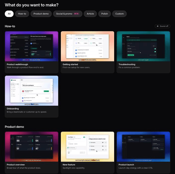
Clevera's content types follow the same split, so the choice you make in the decision table is the choice you make in the gallery. One source can become several independent Content items, which means one recording of a workflow can produce a demo for sales and a how-to for the help center.
Video format | Clevera content type | Starts from |
|---|---|---|
Tutorial | How-to video (product walkthrough, getting started, troubleshooting, onboarding), paired with a how-to article or troubleshooting guide | Screen recording, AI recorder, upload, PDF or slides, screenshots |
Product demo | Product demo (product overview, new feature, product launch, new version, sales pitch) | Same as how-to |
Explainer | Describe what you want: free-form animated explainers and animated infographics | A written brief, plus a link, images or a PDF |
Promo or social clip | Social & promo: feature spotlight, hook reel, music & motion, product tour, AI avatar | A link, images, a PDF, footage, or a text prompt alone |
Launch teaser | Launch types: feature announcement, launch teaser, mystery teaser | Same as social & promo |
Customer story | Customer story, built from real testimonials or reviews | Same as social & promo |
Interactive demo | Not a Clevera format | Use a dedicated interactive demo tool |
The how-to vs demo distinction is built into the generation. A how-to video covers all required actions in logical order, because the goal is that the viewer completes the task. A product demo may skip low-value footage and reorder clips, and its narration explains capability and outcome instead of every click. Both get an AI-written script and voiceover, so you don't need to narrate while recording. See how this works for the AI tutorial maker and the product demo generator.
Social & promo clips come in 9:16, 4:5, 1:1, 16:9 and other sizes, and they're on paid plans along with the AI avatar. The Free plan covers how-to videos, demos and articles, with videos up to 3 minutes. How-to videos and articles translate into 74 languages, which matters most for tutorials.
On staleness, be precise about what updates. LiveSync pushes edits to narration, text, overlays and voice into published embeds instantly, but it doesn't replace footage when your UI changes. For tutorials and demos of web apps, the AI recorder can re-record the flow in a cloud browser from a written instruction, then you regenerate. Desktop software still needs a fresh recording from the desktop app or an upload. The release-day routine is in how to update tutorial videos after a UI change.
Where Clevera is not the right fit
If you need a clickable, self-guided interactive demo, use a dedicated tool; our roundup of interactive demo software compares the options. If your explainer needs custom character animation or a fully illustrated brand world, a motion design agency will give you more control than a prompt. And a filmed, on-site customer interview needs a camera crew; Clevera builds customer stories as motion graphics from testimonial text and reviews you supply.
We made a how-to, a demo and an explainer: here's how they differed
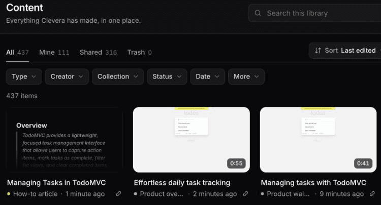
In October 2026 we had Clevera's AI recorder run one task in a demo to-do app: add 3 todos, mark one complete, show only active ones. From that single 0:58 recording we generated 2 videos.
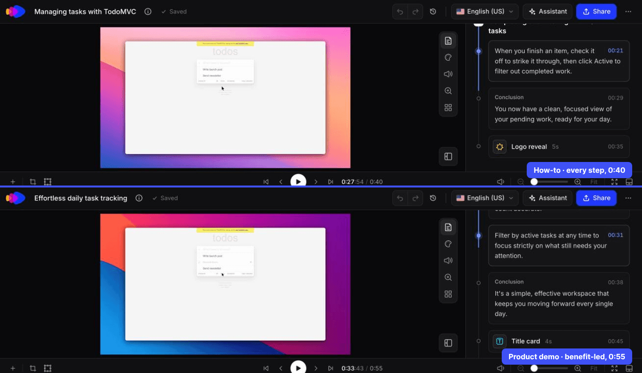
How-to (product walkthrough): "Managing tasks with TodoMVC", 0:40, 2 chapters and 6 steps covering every action in order, through to the final filter click. About 50 seconds and 9 credits, including the recording analysis.
Product demo (product overview): "Effortless daily task tracking", 0:55, about 70 seconds and 6 credits. The title names an outcome, not a task. It also ran 15 seconds longer than the how-to, so a demo isn't automatically the shorter cut.
The 0:40 how-to video Clevera made from that AI recording, unedited.
The 0:55 product demo from the same recording, unedited.
The how-to article from the same recording is the cautionary one. It added a "Clear completed" step nobody performed and dropped the final filter click: the broken tutorial from the top of this post, in writing.
For the explainer, we wrote a Custom brief for one stat, 80% of features rarely or never used (Pendo, 2019), as a filling bar and a closing line. Clevera returned a 1:00 animated clip in about 7 to 8 minutes for 86 credits. The number and the line were right. It ignored the 15 seconds in the brief, since length comes from the Format menu, and the source line was too small for a phone.
The 1:00 animated infographic Clevera returned from the brief, unedited.
Pick the format before you open an editor
Before anyone records, write the one sentence the viewer would type into search or say to a rep. If it starts with "how do I", you're making a tutorial, and it needs every step. If it's "will this work for us", you're making a demo, and it needs the courage to cut. If nobody would say it out loud yet, you need an explainer, and it shouldn't show a single settings page.

