How to add motion graphics to video

Most product videos don't need more motion. They need the viewer's eye in the right place at the right second. When you add motion graphics to video, each one should do 1 of 2 jobs: show where to look, or say what something means. Anything else is decoration, and in a screen recording decoration competes with the UI you're teaching.
Below: the 8 graphics that pull their weight, timing rules for each, a before/after shot list for a 60-second walkthrough, and 3 ways to build them.
The test every graphic has to pass
Play the clip with the graphic and without it. Does the viewer find the right button or number faster with it? If the honest answer is "it looks nicer", cut it. 2 more checks catch most clutter:
One graphic animating at a time. Stagger entrances by at least half a second, or the viewer reads none of them.
The graphic arrives with the narration. If the voiceover says "click Export" and the highlight lands 2 seconds later, the viewer is already hunting. Bring it in on the word, or a few frames before.
8 graphics that earn their place in a screen recording
Graphic | Job | Rule of thumb |
|---|---|---|
Callout (text label) | Names the thing on screen | 2 to 6 words, on screen for at least 2x the reading time |
Zoom + highlight | Shows where the action is | Zoom before the click, hold 1 to 2 seconds after it lands |
Step counter | Tells viewers where they are | Same corner, same style, every step |
Lower third | Names a person or a section | Bottom third, clear of the UI you're demonstrating |
Title card | Separates chapters | 2 to 3 seconds, 1 line of text |
Animated arrow | Points at something a zoom can't isolate | Draw on, then stay still |
Data counter | Makes a number land | Count up in about 1 second, then hold the final value |
Transition | Marks a change of scene or topic | 1 style per video, under half a second |
Callouts
A callout should name the control or state the result: "Billing settings" or "Invoice sent". Keep it to 6 words. The BBC's subtitle guidelines recommend a minimum of around 0.3 seconds per word for subtitles. In a screen recording your viewer is also scanning the interface, so double that: a 4-word callout needs about 2.5 seconds, not 1.2.
Zoom + highlight
The most useful motion graphic on a screen recording, and the most overused. Zoom in 0.5 seconds before the click, hold while the result appears, then zoom out so the viewer sees where they are. A highlight (a soft box or dimmed surroundings) does the same job without moving the frame, which suits dense dashboards where zooming hides context. Use one or the other per action.
Step counters
"Step 3 of 5" in a fixed corner tells the viewer how much is left. Keep the spot and style fixed and change only the number. Under 3 steps, skip it.
Lower thirds
In product video, lower thirds name the presenter in a camera bubble or label a section ("Admin view"). Watch placement: the bottom of most web apps holds save bars and chat widgets.
Title cards
Use them between chapters, not at every step. A 60-second video needs 1, at the start. A title card that needs reading time is a paragraph pretending to be a graphic.
Animated arrows
An arrow beats a zoom when 2 things on screen relate, like "this toggle changes that preview". Let it draw on in about 0.3 seconds, then stop. A bouncing arrow pulls attention for as long as it bounces.
Data counters
Counting up to "1,240 tickets" gives a stat weight in a demo or launch clip. It rarely belongs in a how-to. Animate fast and hold the final number, or the motion is all the viewer remembers.
Transitions
Use 1 style per video, only when the scene or topic changes. Between 2 steps on the same screen, a cut is usually best. Skip flash effects: the WCAG success criterion on 3 flashes or below exists because flashing content can trigger seizures and migraines.
Rules that keep animated overlays consistent
Animated overlays look professional when they look like a system:
1. One motion style. Same easing, same entrance direction, same duration for every callout. If callouts slide in from the left in step 1, they slide in from the left in step 5. 2. Brand templates, made once. Fonts, colors, logo reveal and title card layout belong in a saved template, not rebuilt per video. Every tool below supports this in some form. 3. A safe area. Keep text away from the frame edges and away from the UI controls you're showing. Mark the safe area in your template. 4. Graphics follow the script. Write the narration first, then mark the word each graphic hangs on. No word, no graphic.
Before and after: a 60-second walkthrough shot list
A 60-second walkthrough of "send your first invoice" in a typical SaaS billing app. "Before" is the raw recording with voiceover.
Time | Before (raw recording) | After (with motion graphics) |
|---|---|---|
0:00–0:03 | Dashboard, cursor drifting | Title card: "Send your first invoice" with logo reveal, 3 seconds |
0:03–0:10 | Narrator explains the goal over the dashboard | Step counter appears ("Step 1 of 4"); highlight on the Invoices tab as the narrator names it |
0:10–0:18 | Click Invoices, page loads | Zoom on the New invoice button 0.5 seconds before the click; callout "New invoice" |
0:18–0:32 | Typing customer, line items, amount | Step 2 of 4; zoom out to show the full form; blur on the real customer email |
0:32–0:40 | Scrolling to due date | Step 3 of 4; arrow from the due date field to the payment terms preview |
0:40–0:50 | Click Send, confirmation toast | Step 4 of 4; zoom on the toast; callout "Invoice sent", held 2.5 seconds |
0:50–0:57 | Narrator mentions reminders | Slide transition to the Reminders screen; highlight on the toggle |
0:57–1:00 | Video ends on dashboard | End card with next video title, same template as the opening |
That's 16 graphic events in 60 seconds. It works because entrances are staggered and each one hangs on a word in the script. The blur is for privacy, and it's the one graphic you never skip on real customer data.
3 ways to add motion graphics to video
1. A traditional editor: Premiere, After Effects or DaVinci Resolve
Adobe Premiere with After Effects. Motion Graphics templates (.mogrt files) are built in After Effects and reused in Premiere. Per Adobe's help page, you drag a template from the Graphics Templates panel onto a video track, then change it in the Edit tab of the Properties panel. Data-driven templates fill bar charts and line graphs from spreadsheet data, which is the cleanest route to accurate data counters and charts.
DaVinci Resolve. The Fusion page is a node-based compositor inside Resolve, with over 200 tools. You can build lower thirds, animated backgrounds and transitions in Fusion, save them as macros and expose only the controls an editor should touch. They then appear in the Edit page's effects library for any project. Resolve is a free download; Resolve Studio is listed at $295.
Best for: teams with a motion designer who builds templates once, and editors who reuse them. Tradeoff: zooms and callouts on a screen recording are keyframed by hand, every time.
2. A template-based editor: Canva or CapCut
Canva lets you animate pages, elements and text from the Animate button, with Slow, Medium or Fast presets or exact intro and outro durations. "Show element timing" lets you set when each element appears, and "Create an Animation" lets you drag an element along a motion path. Brand Kits store logos, colors and fonts so templates stay on brand.
CapCut has a library of text templates and text animations, and on desktop you can keyframe position, scale, rotation and opacity. That's how you'd build a manual zoom or a sliding callout.
Best for: marketers who already live in these tools and need animated text over short clips. Tradeoff: neither is built around screen recordings, so zooms that follow clicks, cursor cleanup and privacy blurs are manual work.
3. Clevera: overlays on a timeline, or a brief in plain words
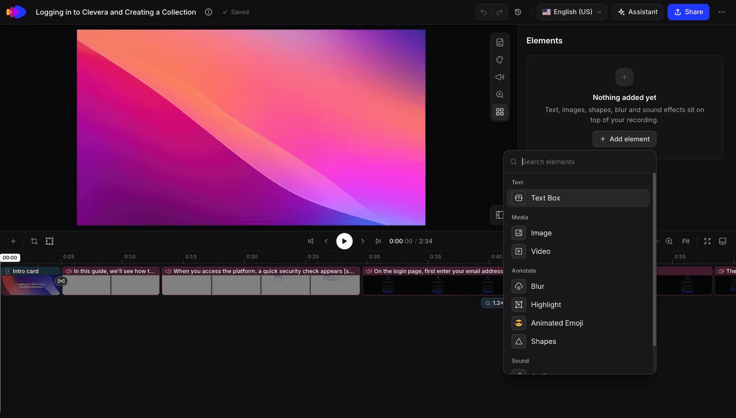
Clevera starts from the recording. For AI-narrated how-to videos and product demos, it smooths the cursor, highlights key interactions and applies smart zoom while it writes and syncs the voiceover. Most of the zoom + highlight work in the shot list above is done before you open the editor.
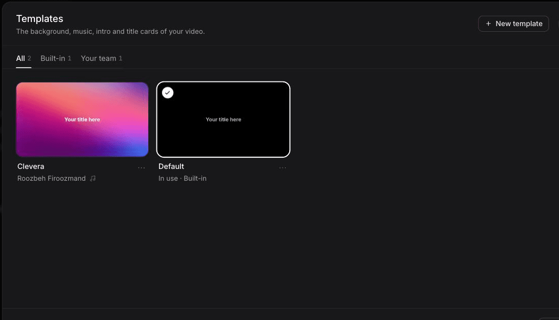
In the timeline editor, you then add or adjust the rest: text, image, blur and highlighter overlays, title cards, intro cards, logo reveals, zooms and transitions such as zoom cross, staircase, blinds, dissolve, soft wipe and slide. Title cards, logo reveals and video style save as premade or custom templates, so the second video looks like the first. If you only want your own recording styled with zooms, overlays and title cards, the styled (share-ready) option uses no AI credits, so it's unlimited on every plan, including Free (Free exports are 1080p with a watermark).
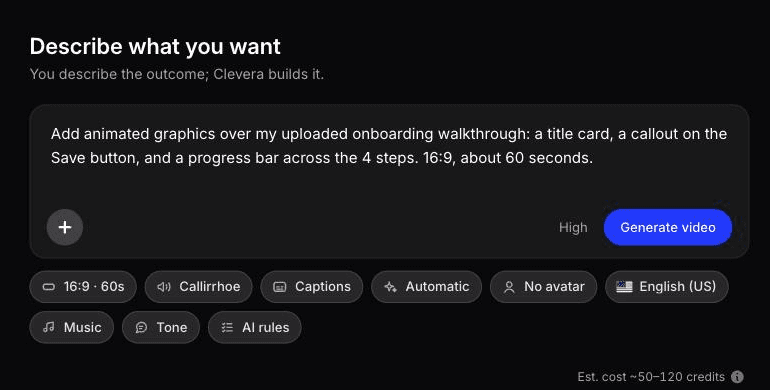
For graphics outside that list, use Describe what you want in the AI motion graphics generator. You write a free-form brief, such as "add an animated counter from 0 to 1,240 at 0:45 and an arrow from the due date field to the terms preview", and Clevera builds animated graphics on top of the existing video. The editor's overlay list doesn't include a dedicated arrow or counter, so this is the route for those.
Edits to text, highlights and blurs on a published Clevera video update every hosted link and embed, so a renamed button label gets fixed once. New UI still needs new footage.
Best for: product, support and marketing teams who make walkthroughs every week without an editor. Tradeoff: the AI recorder captures websites and web apps only, so desktop-software footage comes from the desktop app or an upload. And see the next section for the jobs it shouldn't do.
What Clevera added on its own, and what it didn't
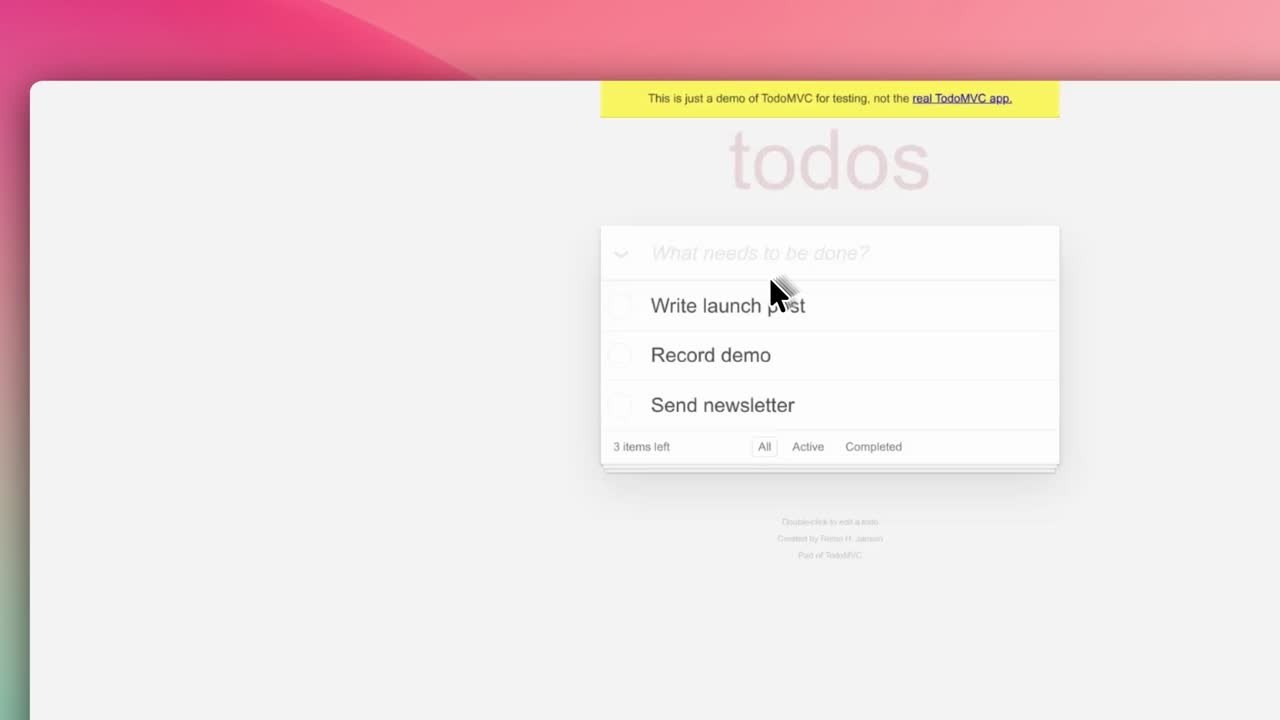
In October 2026 we had Clevera's AI recorder capture a short task in a demo to-do app, 0:58 of raw footage, and turned it into a how-to video. About 50 seconds and 9 credits later, the timeline already held an intro card, a logo reveal and auto zooms at 1.5x and 1.8x, cut down to 0:40. That's the title card and zoom rows of the shot list done. Callouts, a step counter and arrows weren't there; those are yours to add.
We then ran Styled for sharing on the same recording with our team template instead of the built-in Default. It took about 25 seconds and 0 credits. The output ran 1:07, longer than the source because of the intro card, with 2 auto zooms at 1.8x and the editor open on the Style panel for background, padding, corners and cursor. The recorded page itself looked faded and low-contrast; the Style panel frames footage, it doesn't fix it.
The 1:07 Styled for sharing version of the same recording, unedited, 0 credits.
For the brief route, a Custom brief built a 1:00 animated infographic with a filling bar in about 7 to 8 minutes for 86 credits. The numbers were right, but it ignored the 15 seconds written in the brief (length is set in the Format menu) and the source line came out too small for a phone. That clip was built from scratch. We haven't yet tested graphics layered onto an existing recording.
The 1:00 animated infographic Clevera returned from the brief, unedited.
When a motion designer is worth paying for
AI editors and templates cover the graphics in this guide. They don't replace a motion designer for:
A launch hero video or brand film where every frame is art-directed and the motion itself is the message.
Tracked graphics on moving footage, like a label that follows a phone in a handheld shot.
3D, character animation or custom illustration in motion.
Your template system. One week of a designer's time building your lower thirds, title cards and logo reveal in After Effects or Fusion pays off across every video your team makes after it, in any tool that accepts templates.
The usual split: a designer for the system and the flagship launch, an AI tool or template editor for the weekly walkthroughs.
Start with the zoom
If you add one thing to your next screen recording, make it a zoom that lands half a second before the click. It fixes the most common complaint about product videos, "I couldn't see what you clicked", and every other graphic in this guide builds on that habit of putting the viewer's eye where the narration is pointing.

