How to make an animated infographic with AI

An animated infographic maker can turn a spreadsheet row into a 10-second clip in minutes. The hard part isn't the motion. It's making sure the number on screen is the right number, and that someone scrolling on a phone can read it before it moves away. This guide covers both, then shows how to write a brief an AI can build from.
Start with one number per clip
A static infographic can hold 12 stats because the reader controls the pace. Video takes that control away. Every extra number competes for the same 2 or 3 seconds of attention, so the viewer remembers none of them.
Write the story as one sentence before you open any tool: "Support tickets fell 38% in the 6 weeks after we shipped in-app guides." If you can't get it into one sentence, you have 2 clips, not 1. A 30-second data story can carry 3 numbers if each gets its own scene and they build on each other (the problem, the change, the result). More than that and you're making a slide deck with a soundtrack.
Data hygiene: lock the numbers before the AI sees them
Generative tools are built to fill gaps. Venngage's Animated Charts tool says it plainly: you describe the story and "AI drafts the chart, data, style, and motion." That's useful for a layout draft and dangerous for a published stat. If you don't supply the numbers, something will.
Build a source sheet first, one row per number:
Field | Example |
|---|---|
Value as published | 38% |
Unit and base | % change in weekly tickets, vs 6-week average before launch |
Period | 2026-07-01 to 2026-08-11 |
Source | Internal helpdesk export, or the URL and page section |
Rounding rule | Whole percent on screen, 1 decimal in captions |
Checked by | Name, date |
Then apply 3 rules:
1. Paste numbers verbatim and tell the AI not to add any. "Use only the numbers below. If a scene needs a number that isn't listed, show XX and flag it." 2. Put the unit and the period on screen. "38%" alone invites the question "of what?" "38% fewer tickets, Jul to Aug 2026" doesn't. 3. Check every frame after generation. Read the final settled value in each scene against the sheet. Look for rounding drift (38.4% in one scene, 38% in the next), a dropped minus sign, or an axis that quietly doesn't start at 0.
Add a source line to the last frame: "Source: Acme helpdesk data, Jul to Aug 2026." It costs 2 seconds and answers the first comment you'd otherwise get.
Pick a chart that survives motion
Motion adds meaning. A bar growing from 0 says "this accumulated." A counter ticking up says "this happened over time." Choose the chart whose motion matches what the data did.
Counter (one big number). Best for a single headline stat. Count up for 1 to 1.5 seconds, then hold. Count from a meaningful baseline (last year's figure) if the story is growth, not from 0.
Before/after bars. Best for a change between 2 points. Same baseline, same scale, and animate only the second bar so the eye goes to the change. Label the difference ("-38%") once the bar settles.
Bar race. Best for rankings that change over many periods. Flourish and Canva Charts both offer bar race charts for time-based data. On a phone, cap the visible bars at around 8 and make the period label the biggest text on screen, because it's the clock the whole chart runs on.
Proportion (waffle grid or single stacked bar). Best for "1 in 4" or share-of-total stats. A 10 x 10 dot grid filling in reads faster than a pie slice sweeping open, because people count dots more accurately than they judge angles.
Skip self-drawing line charts unless the shape is the story. On a phone, a 3-second draw over 24 months reads as a squiggle.
Readability rules for small screens
Most data clips are watched on a phone, in a feed, often with the sound off. Design for that first.
Text size. WCAG doesn't set a minimum font size for video. It does define large text as 18pt or 14pt bold, about 24 or 18.5 CSS pixels, which is the threshold where a lower contrast ratio is acceptable. Do the arithmetic for your frame: a 1080-pixel-wide vertical video on a phone around 400 CSS pixels wide is scaled down to roughly 37%. To land at 24 CSS pixels on the phone, text needs to be about 65 pixels tall in the 1080 frame. Labels at 16 CSS pixels need about 44 pixels. A 16:9 video watched upright on the same phone is scaled to about 21%, so the same text needs to be almost twice as big.
Contrast. Keep text at 4.5:1 against its background, or 3:1 for large text. Animated gradient backgrounds are the usual failure: the number passes contrast in frame 1 and fails in frame 90.
Time on screen. A working rule: let the number settle, then hold it for at least 2 seconds with its label visible before anything else moves. If you can't read the clip aloud at a normal pace while it plays, it's too fast.
Flashing and looping. Fast-ticking counters and strobing highlights can cross the line WCAG sets at 3 flashes in any 1-second period. If you embed the clip on a web page where it plays automatically for more than 5 seconds next to other content, give viewers a way to pause or stop it.
Say the number, too. Numbers that appear only as on-screen text are lost to anyone who can't see the video. W3C's guidance on description of visual information notes that integrated description, woven into the main script, is usually best for training-style videos. For a data clip, that means the voiceover says "38% fewer tickets," not "look at this."
A storyboard template you can copy
Fill this in before you generate anything. It doubles as your brief.
Scene | Seconds | On screen (exact text) | Motion | Voiceover |
|---|---|---|---|---|
1. Hook | 0 to 3 | "Support tickets, before and after in-app guides" | Title slides in | "We shipped in-app guides in July." |
2. Before | 3 to 7 | "1,240 tickets/week (May to Jun avg)" | Bar grows from 0 | "Before, we averaged 1,240 tickets a week." |
3. After | 7 to 12 | "769 tickets/week (Jul to Aug avg)" | Second bar grows, stops short | "Six weeks later, 769." |
4. Result | 12 to 16 | "-38%" | Counter settles, holds 2 s | "That's 38% fewer tickets." |
5. Source | 16 to 18 | "Source: Acme helpdesk, May to Aug 2026" | Fade in | None |
(The numbers above are placeholders to show the format. Replace them with your own sourced figures.)
Write the brief so the AI builds it
A good brief reads like instructions to a junior motion designer who has never seen your data. Include:
``` Format: animated infographic, 9:16, about 18 seconds, voiceover on. Story in one sentence: [your sentence] Numbers (use only these, verbatim, with units):
[value] [unit], [period], source: [source]
[value] [unit], [period], source: [source]
Scenes: [paste the storyboard table] Chart types: before/after bars on a shared baseline starting at 0, then a counter. Readability: headline numbers at least 96 px tall in a 1080 x 1920 frame, labels at least 44 px, high contrast, nothing in the bottom 15% of the frame. Hold each final number for 2 seconds before the next scene. Last frame: source line. If any number is missing, show XX and do not invent one. Brand: [colours, font, logo], tone: [plain, calm]. ```
The bottom margin keeps numbers clear of captions and app buttons in vertical feeds. Check your platform's safe zones.
Making the clip in Clevera
Clevera's gallery covers set formats like product demos, how-to videos and social clips. Below the gallery, Describe what you want, Clevera's AI motion graphics generator, takes a free-form brief and builds animated videos that don't fit those types, such as an animated infographic, a data story or an educational explainer. It also adds animated graphics on top of an existing video.
Paste the brief above into the prompt box, then set length and aspect ratio in the Format menu. Clevera takes them from there, not from the brief text. You can attach material too: a link, images, or a PDF or slide deck that holds your numbers. Each clip starts from a pre-built design system and motion style, and you change either in the prompt ("use our navy and lime palette, slower easing, no bounce"). The Format menu offers 9:16, 4:5, 1:1 and 16:9, plus other sizes, with lengths of about 35 seconds, 60 seconds or 2 minutes, so the shortest preset runs longer than the 18 seconds in the template above.
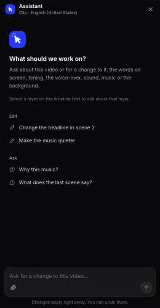
Edits happen in the clip editor. The AI assistant makes targeted changes from a prompt ("hold scene 4 for 1 more second", "make the -38% bigger", "change the source line to Jul to Aug 2026"), and revision history lets you preview and restore earlier versions. You can also add elements such as highlights, shapes and images, and adjust captions, music and sound effects there. The overall Look is chosen before you generate. Once it's right, the clip can be translated into 74 languages, which matters for data stories: the numbers stay the same, so you only need to check that units and date formats read correctly in each language.
Run the frame-by-frame number check on the output, every time. The brief rule "use only these numbers" reduces the risk of invented figures; it doesn't remove your job as the last reviewer.
For how Clevera fits a launch or campaign workflow alongside demos and social clips, see AI for product marketing teams.
We made one: 80% of features, a filling bar, 86 credits
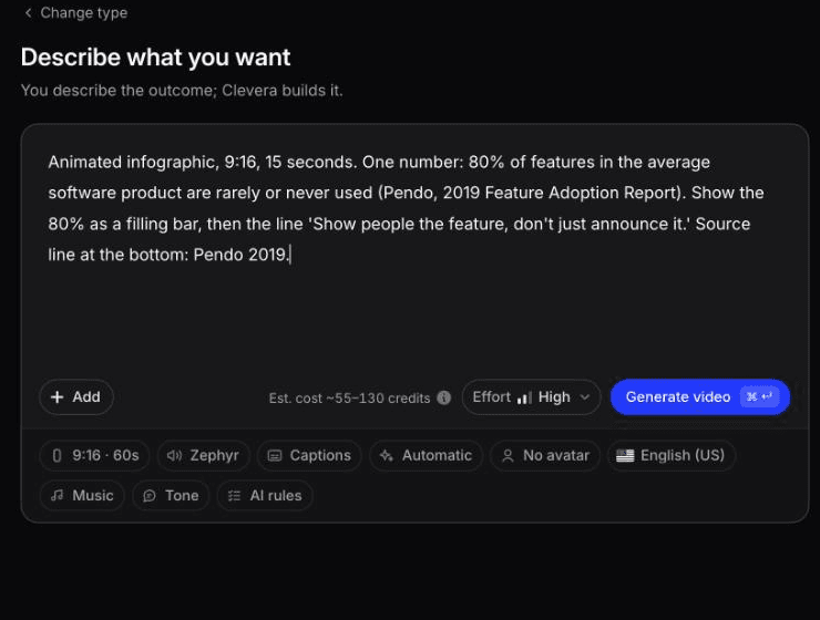
In October 2026 we ran a real stat through Clevera's Custom brief ("Start from scratch", then "Describe what you want"). This is the brief, word for word:
> Animated infographic, 9:16, 15 seconds. One number: 80% of features in the average software product are rarely or never used (Pendo, 2019 Feature Adoption Report). Show the 80% as a filling bar, then the line 'Show people the feature, don't just announce it.' Source line at the bottom: Pendo 2019.
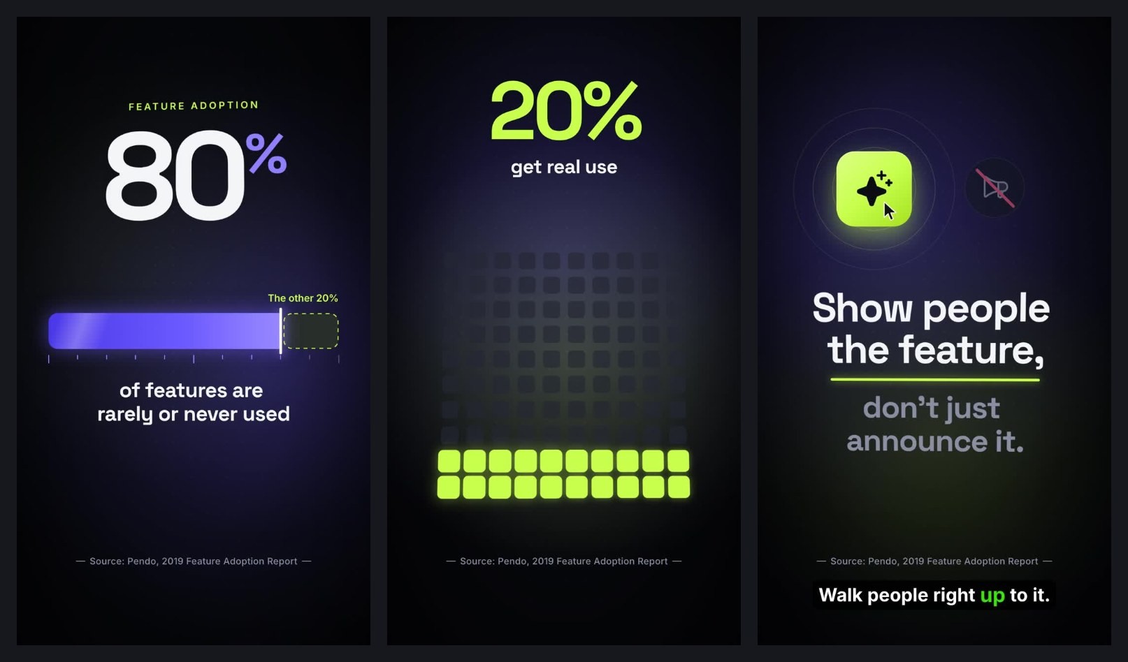
The 1:00 animated infographic Clevera returned from the brief, unedited.
It took about 7 to 8 minutes and 86 credits. The numbers held: at 0:19 a large "80%" sits on a filling bar labelled "of features are rarely or never used", and at 0:46 the closing line renders word for word. Nothing in the figures was invented.
What we'd fix before posting:
Length. We got 1:00, not 15 seconds. Clevera takes length from the Format menu, which we'd left at 60 seconds, and ignored the one written in the brief.
Source line. It used the long form, "Source: Pendo, 2019 Feature Adoption Report", not "Pendo 2019", and it's too small to read on a phone.
Captions. One narration caption mid-video didn't match the on-screen line. Your frame check has to cover captions too.
Animated infographic maker options, and when to hire a designer
Here's what each tool does for this job, based on its own pages.
Tool | What it's good at for data video | Limits to know |
|---|---|---|
Canva | Infographic video templates, 30+ chart types including bar race, and an Animate panel with per-element timing | You build the layout and timing by hand. Some templates and animations are Pro-only |
Venngage Animated Charts | Prompt or image to one animated chart, 10 styles, GIF/MP4/PNG with transparent backgrounds, 1 to 30 second loops | One chart per loop. The AI drafts data, so replace it with yours |
Flourish | Data-bound bar races and charts from an uploaded spreadsheet, built mainly for interactive embeds | MP4 export is a premium feature enabled by Flourish, capped at 300 seconds, with no audio |
Clevera | Multi-scene animated data stories from a written brief, with voiceover, editing by prompt, 4 main aspect ratios and translation | Not a charting engine bound to a live spreadsheet. Frame-level choreography is limited to what you can describe |
Pick Flourish when the chart has to be exactly bound to a large dataset, like a 40-period bar race. Pick Venngage when you need a single transparent loop to drop into a slide or another video. Pick Canva when you want a template and full manual control. Pick Clevera when you want a narrated, multi-scene clip from a brief, in the aspect ratio you need, without building each scene yourself.
When After Effects and a motion designer win. Hire one for a flagship piece: an annual report film, a brand campaign or a keynote opener, where every easing curve, transition and typographic detail is designed by hand. Also go to a designer when the visual is novel (a custom map projection, a 3D data sculpture, a chart type no tool offers) or when the animation has to sync frame-accurately to a music score. AI makers, Clevera included, work from a design system and a motion style; they won't invent a visual language for you.
The check that matters most
Before you post, play the clip on your own phone, upright, with the sound off. Read every number aloud as it settles and compare it with your source sheet. If you missed one, slowed down, or had to squint, fix the scene, not the caption. An animated infographic is only as good as the number a viewer remembers 5 seconds later.

