Animated training videos with AI: a guide

Most software training fails in one of 2 ways. The concept video shows 4 minutes of clicking when the learner needed one diagram of how permissions inherit, or the "explainer" animates a settings page that should have been a 40-second screen recording. Animated training videos made with AI are now cheap enough that cost isn't the constraint. The decision that matters is which lessons need animation, which need the real screen, and how to design each clip so people learn from it. This guide is for L&D and enablement teams at software companies.
When animation beats a screen recording
A screen recording shows what happens on screen. Animation shows what happens behind it. That one distinction settles most format decisions.
What the lesson teaches | Better format | Why |
|---|---|---|
A concept or mental model (how roles inherit from workspace to project, what "sync" means across 2 systems) | Animation | The thing you're teaching has no screen. You need boxes, arrows and change over time. |
A process across people or systems (how a support ticket escalates from tier 1 to engineering) | Animation | A recording can only show one app at a time; the handoffs are the lesson. |
A policy (data retention, approval limits, what counts as PII) | Animation | Policies are rules and exceptions. Visual sorting ("this goes here, this doesn't") beats a narrator reading a PDF. |
An exact click path (creating an invoice, configuring SSO) | Screen recording | Learners need to recognise the real UI when they go back to it. |
A troubleshooting fix for a specific error | Screen recording | The error message and the button are the content. |
Research backs the split. A meta-analysis of 26 studies by Höffler and Leutner found animations beat static pictures on average (d = 0.37), with larger effects when the animation was representational rather than decorative (d = 0.40), when it was highly realistic such as video (d = 0.76), and when the goal was procedural-motor knowledge (d = 1.06). For software training: decorative motion adds little, and for "do these exact steps" learning, the realistic option is a recording of the real UI.
So the rule: animate the model, record the clicks. If an animated clip contains a drawn copy of your settings page, it should probably be a screen recording.
Design rules for instructional video, from the research
Richard Mayer's multimedia learning principles are the standard evidence base here. The University of Washington School of Medicine's summary and Cynthia Brame's review, Effective Educational Videos in CBE Life Sciences Education, are good academic entry points. 5 principles matter most.
Signalling. Highlight what matters with 2 or 3 on-screen key words, a colour change or an arrow. Brame cites studies showing it improves retention and transfer from animations and from video. In practice: one highlighted term per scene.
Segmenting. Chunk the lesson into short pieces the learner controls. For animated training content, that means one concept per clip, or chapters between ideas.
Coherence (weeding). Cut interesting-but-irrelevant material. Brame lists background music, complex backgrounds and extra features in an animation as things that raise extraneous load. Animated video breaks this rule most often, because motion graphics make decoration free. One nuance from the review: what's extraneous for a new hire can help an expert, so weed for your actual audience.
Modality and redundancy. Explain the visual with narration, not with paragraphs of on-screen text. People learn better from graphics plus narration than from graphics plus printed text, which compete for the same visual channel. Keep on-screen words to labels.
Personalization. A conversational script ("you'll see the request land in your queue") beats formal language ("the request is subsequently routed").
On length, Brame summarises Guo, Kim and Rubin's analysis of 6.9 million video sessions in 4 edX courses: median engagement was close to 100% for videos under 6 minutes and fell to about 50% for 9 to 12 minutes. That's university data, so treat 6 minutes as a ceiling, not a target.
A lesson-sized structure: 60 to 180 seconds
60 to 180 seconds isn't a research number. It's a constraint that forces one idea per clip, which is what segmenting asks for, well under the 6-minute drop-off. Use 5 beats:
1. Hook (5 to 10s). The situation where the learner needs this. "A customer asks why their teammate can see a project they can't." 2. Model (20 to 60s). The core diagram, built up one piece at a time. Signal each new element as it appears. 3. Example (20 to 60s). Run one concrete case through the model. Same visual, one path highlighted. 4. Exception or mistake (10 to 30s). The thing people get wrong. This is often the most valuable beat. 5. Bridge (5 to 15s). Point to the next step: "Now watch how to change a role in the admin panel."
If a draft runs past 180 seconds, split it. The overrun is almost always a second concept hiding in beat 3 or 4. For more on why short units work for software teams, see microlearning vs traditional training.
Script and storyboard template
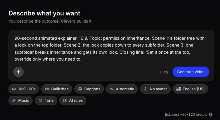
Copy this into a doc or sheet. One row per scene; most 90-second clips land at 6 to 9 rows.
# | Beat | Time | Narration (spoken, conversational) | On screen (visual + max 3 words of text) | Signal | Accessibility note |
|---|---|---|---|---|---|---|
1 | Hook | 0:00–0:08 | "Your teammate can see the Q3 project. You can't. Here's why." | 2 user icons, one project card, one lock | Lock pulses once | Narration names both users, so no extra description needed |
2 | Model | 0:08–0:30 | "Access starts at the workspace. Every project inherits it." | Workspace box, 3 project boxes, arrows down | Label: "Inherits" | Describe arrows in narration ("flows down to each project") |
3 | Model | 0:30–0:50 | "A project admin can restrict a project. That breaks inheritance for that project only." | One arrow turns grey, lock on one box | Label: "Restricted" | Say which project is restricted |
4 | Example | 0:50–1:10 | "Sam's a workspace member, but Q3 is restricted, so Sam needs a direct invite." | Sam icon follows arrows, stops at lock | Highlight Sam's path | |
5 | Mistake | 1:10–1:25 | "Making Sam a workspace admin won't fix it. Restrictions still apply." | Admin badge on Sam, lock stays | Label: "Still locked" | |
6 | Bridge | 1:25–1:35 | "Next: how to invite someone to a restricted project." | End card with next lesson title | Next lesson title is spoken, not only shown |
Write the narration column first and read it aloud with a timer; visuals follow the words. If an "on screen" cell needs more than 3 words, that text belongs in the narration.
Accessibility: captions, description and flashing
Captions. WCAG success criterion 1.2.2 (Level A) requires captions for all prerecorded audio in synchronized media, including meaningful sound effects, not only speech. The W3C's captions guidance is blunt that automatically generated captions don't meet requirements unless confirmed fully accurate; they're a starting point. Its own example shows "4 to 5 minutes" captioned as "45 minutes". In policy training, a misheard number or a dropped "not" changes the rule. Budget a human review pass, and prefer closed captions over burned-in sentences, which also fight the redundancy principle.
Description of visual information. If the animation shows something the narration doesn't say, blind and low-vision learners miss it. The W3C's description guidance notes that integrated description, where the narrator describes the visuals as part of the script, is usually best for training videos. That's why the template has an accessibility column: write "flows down to each project", not "as you can see here".
Flashing. WCAG 2.3.1 prohibits content that flashes more than 3 times in any 1-second period above the flash thresholds. One pulse to signal a lock is fine; a strobing alert effect isn't.
Pairing an animated concept clip with a screen recording
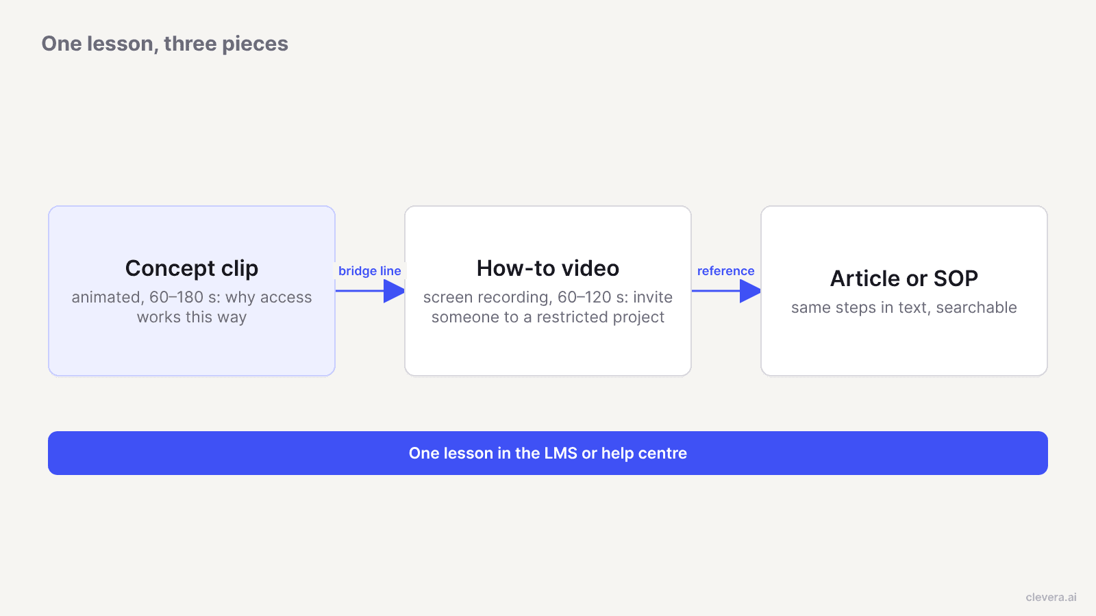
The strongest software lesson uses both. The animation builds the mental model; the recording applies it to the real UI. Learners who skip the concept still get the steps, and those who watch both can handle cases the steps don't cover.
A few rules for the pairing:
Same vocabulary. If the UI says "private", don't call it "restricted" in the animation.
Same example. Reuse Sam and the Q3 project. Continuity lets the learner map the model onto the screen.
Bridge line at the end of the concept clip, naming the exact task the recording covers.
Text version for reference. People watch to learn and search to remember. An SOP with the same steps covers the second job. For the written side, see how to create an SOP with AI.
Making animated training content with Clevera
Clevera covers both halves of the pair, plus the text version.
The concept clip. "Describe what you want" is the free-form mode of Clevera's AI motion graphics generator. From a written brief, Clevera builds animated videos outside its gallery types, such as educational explainers, lesson content or animated infographics, and it can layer animated graphics over an existing video, such as a signalling callout on a screen recording. Paste the narration and on-screen columns from the template as the brief. It suits diagram-style explainers like the permissions example; it won't make any animation you can imagine, so check the draft against your storyboard.
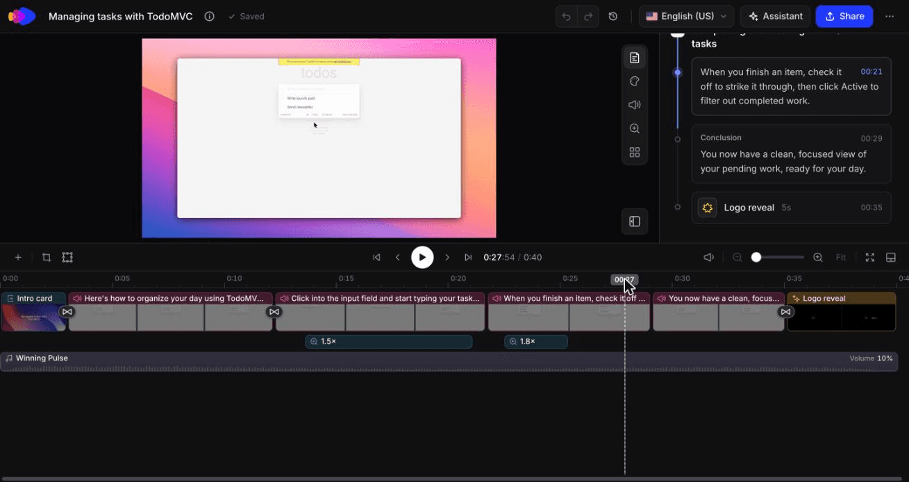
The how-to video. Record the click path with the desktop app (macOS or Windows) or the Chrome extension, or let the AI recorder capture a web app in a cloud browser from a written instruction. The AI recorder is read-only by default and you can take over mid-recording. Clevera removes pauses and stray clicks, writes the script from the on-screen actions, adds a synthetic voiceover, and applies smart zoom and highlights, which handles much of the signalling. See how teams use this for internal tool and employee training.
The article or SOP. The same recording can produce a separate article or SOP with captioned screenshots, pairable with the video on a share page.
Consistency and translation. Team AI rules fix tone, terminology and pronunciation across clips. Videos and articles translate into 74 languages with one click; for the process side, see how to localize SaaS onboarding videos.
Announcements. For internal announcements, such as a policy taking effect, the AI avatar type lets an avatar you pick talk people through it. AI avatar is on paid plans. The Free plan includes how-to videos, articles and translation, with videos up to 3 minutes; see pricing.
Narration edits published in Clevera update hosted links and embeds without re-exporting. If the UI itself changes, you record new footage.
We built both halves: a 1-minute concept clip and a 40-second how-to
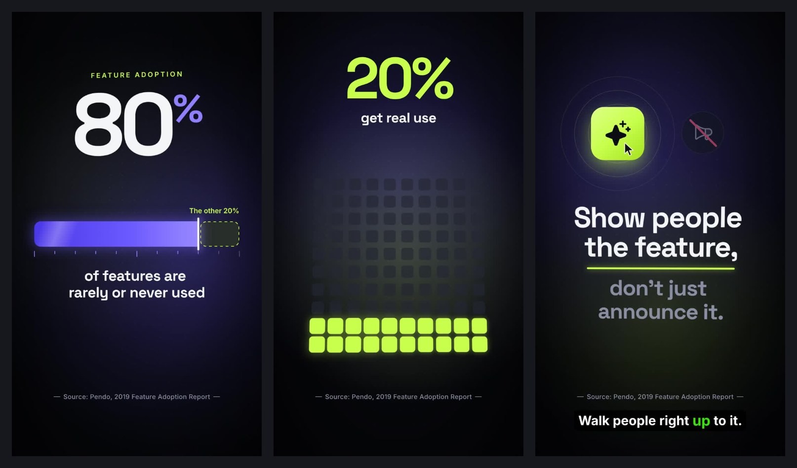
In October 2026 we made one of each in Clevera. They cover different subjects, so they aren't one lesson, but they show what each half takes.
The concept clip. We wrote a Custom brief ("Describe what you want") for one stat, 80% of features rarely or never used (Pendo, 2019), shown as a filling bar followed by a single closing line. Clevera returned 6 scenes in about 7 to 8 minutes for 86 credits, with the number, the bar and the source line right. It ran 1:00 instead of the 15 seconds in the brief, because length comes from the Format menu, not the text. The source line was too small for a phone, and one narration caption didn't match the on-screen line, the kind of mismatch the caption review pass above exists to catch.
The 1:00 animated infographic Clevera returned from the brief, unedited.
The how-to. The AI recorder took a written instruction for a public demo to-do app (add 3 todos, mark one complete, show only active ones) and followed it exactly in about 78 seconds. The 0:58 of footage, agent pauses included, became a 0:40 walkthrough with 2 chapters and 6 steps in about 50 seconds, for 9 credits. A how-to article from the same recording cost 3 more credits but added a "Clear completed" step that never happened, so check the text version against the video before it goes into your LMS.
Where Clevera is not the right fit
Character-driven scenario training. Soft-skills lessons with recurring characters, dialogue and branching choices need a dedicated scenario tool or a motion designer.
Quizzes, branching and completion tracking. Clevera makes the video and article. In-video questions, which Brame's review links to better test performance, and SCORM tracking belong in your LMS.
The voice principle. Mayer's voice principle favours a human voice over a machine voice. Clevera's how-to and demo narration is synthetic. When a familiar voice matters, such as a CEO policy message, record it yourself and use the styled or cleaned-up options, which keep your voice.
Desktop-only apps with the AI recorder. The AI recorder works on websites and web apps only. For desktop software, record with the desktop app.
Captions. Plan caption review in your player or LMS, and hold any generated text to the W3C's accuracy standard.
Start with the lesson your trainers re-explain most
Pick the concept your trainers draw on a whiteboard every cohort, the diagram that never makes it into the docs. Storyboard it at 90 seconds, pair it with a recording of the task that depends on it, and ship both as one lesson. If learners stop asking the whiteboard question, the format works. If they don't, the animation is decorating the problem, and the storyboard will show you which beat to rewrite. For the rest of your library, see the guide to creating training videos.

